Luna is a technology and AI company built around the idea of making advanced technology feel simple, intuitive, and accessible. The goal of this logo was to create a minimal yet distinctive visual identity that subtly communicates technology and artificial intelligence without relying on overused tech clichés.
The concept explores simplicity, intelligence, precision, and innovation, translating these qualities into a clean and modern mark designed to feel memorable, scalable, and relevant in a rapidly evolving digital world.
The result is a contemporary identity that gives Luna a clear and confident presence—balancing technological character with a refined, timeless aesthetic.
The LUNA logo brings together the brand’s identity as a modern technology and AI company with the visual inspiration behind its name—the moon.
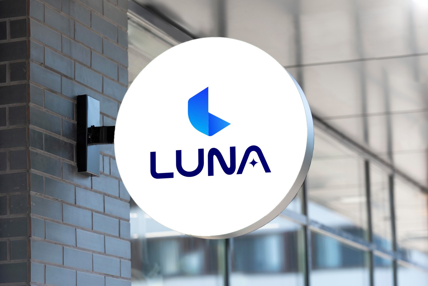
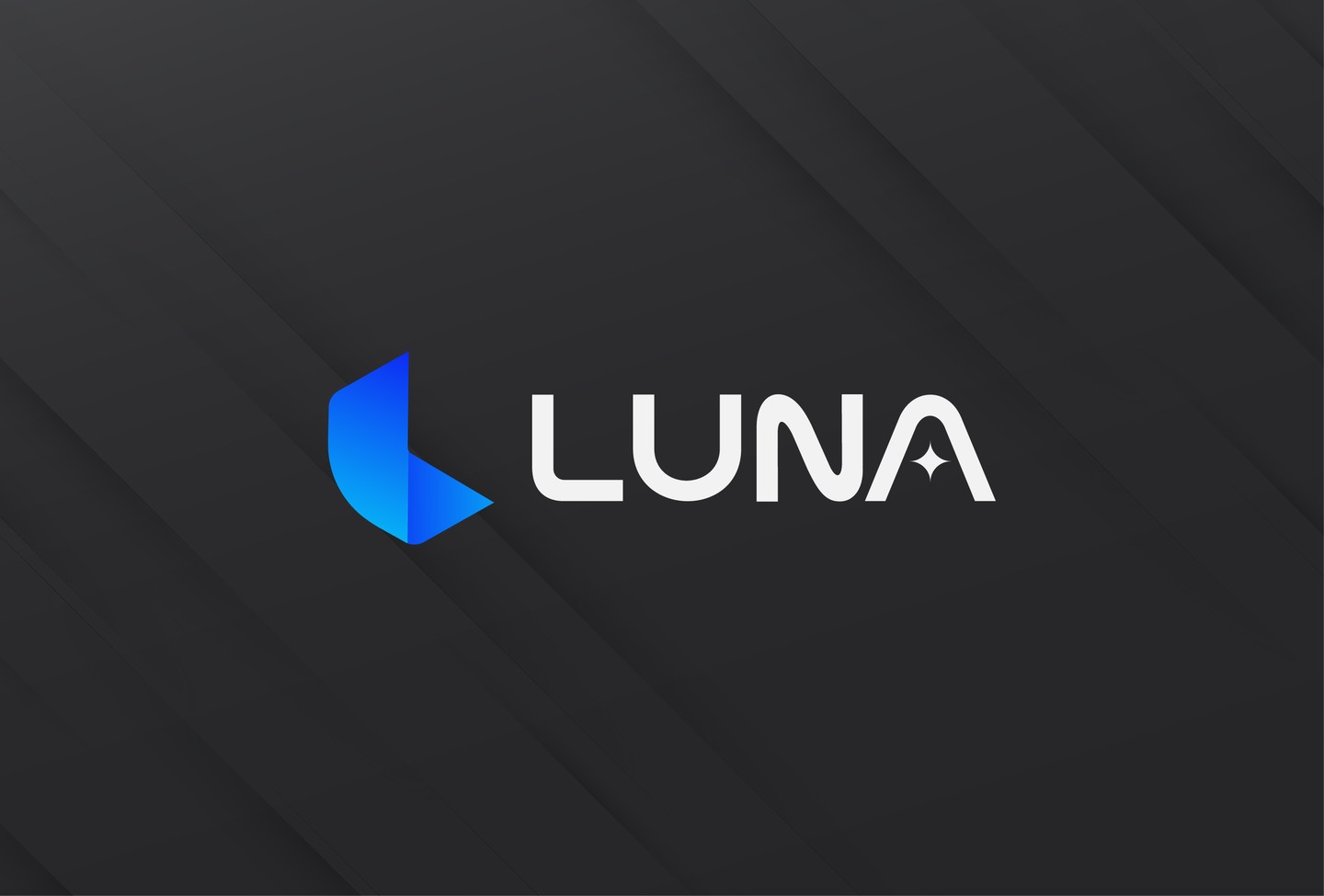
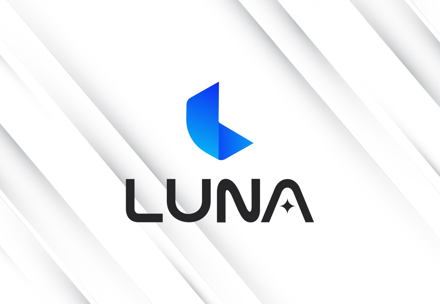
The abstract symbol is built around the letter “L” from LUNA. Its curved form subtly evokes the shape of a crescent moon, representing inspiration, elegance, and the quiet power of intelligence. In contrast, the sharper edge introduces a sense of precision and direction, reflecting digital innovation, technology, and a forward-looking mindset.
The symbol is paired with a custom typographic treatment designed to feel clean, modern, and distinctive. A key detail is the star integrated into the letter “A”, creating a subtle connection to the night sky while symbolizing creativity, discovery, and the limitless possibilities enabled by artificial intelligence.
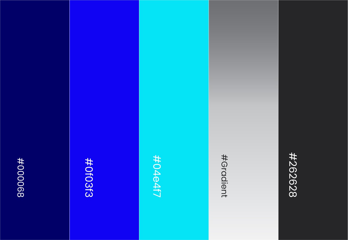
The vibrant blue color palette reinforces the brand’s connection to technology and AI, while adding a sense of trust, professionalism, energy, and contemporary sophistication.
Overall, the LUNA identity is simple yet meaningful—balancing the poetic character of the moon with the confident, precise, and forward-thinking spirit of a modern technology company.
All rights preserved for OMO studio ©